VBT rebrand

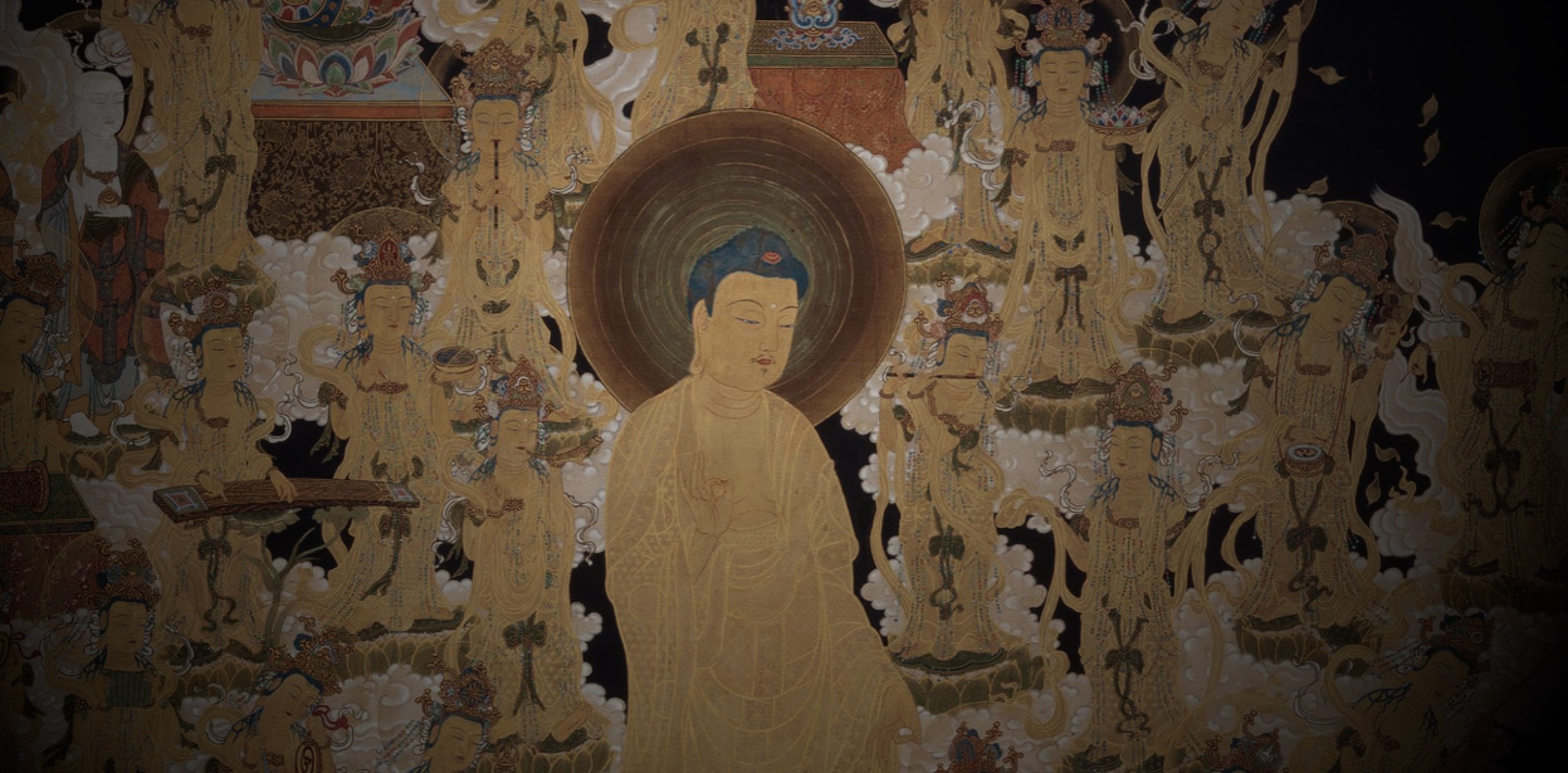
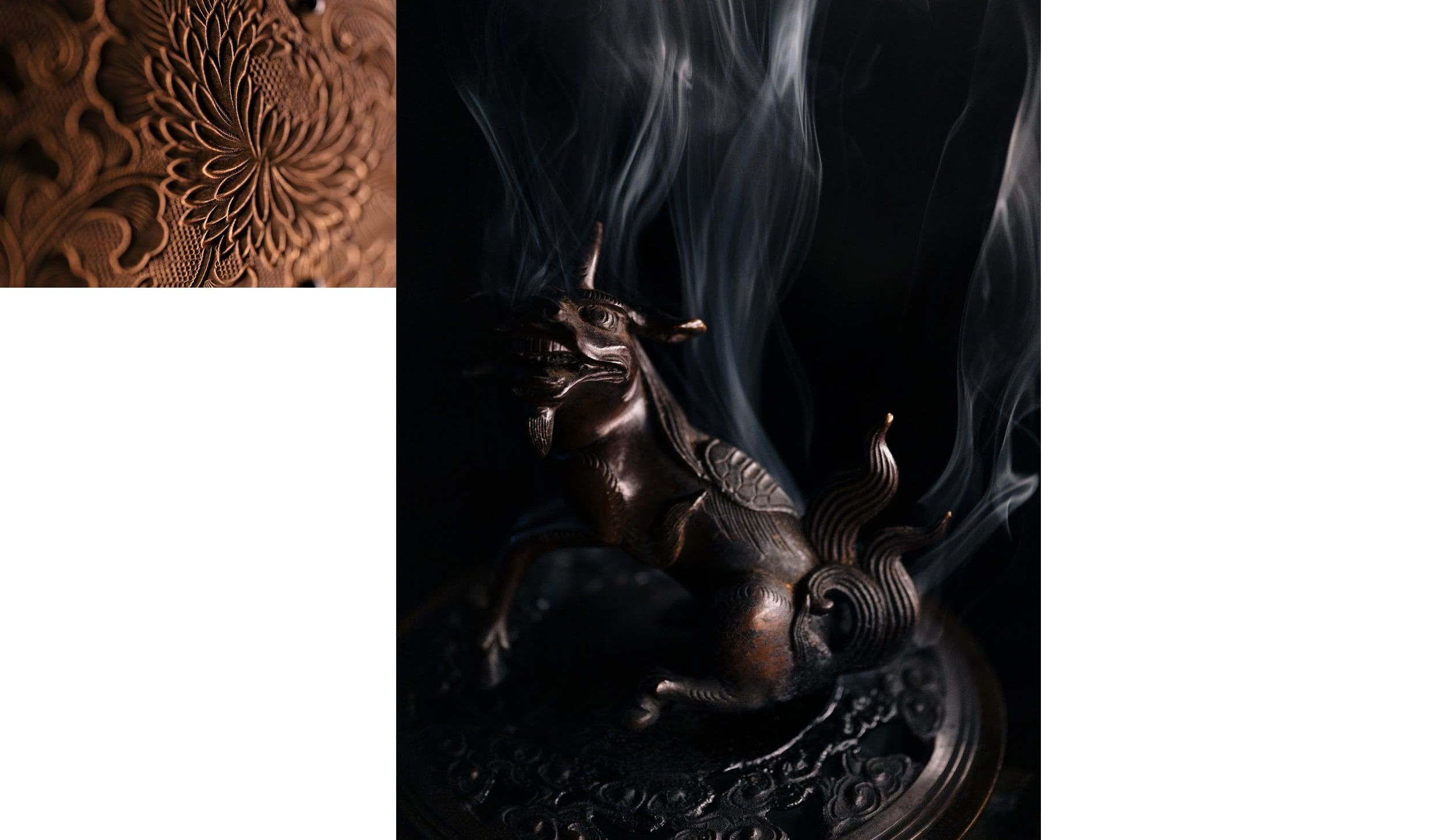
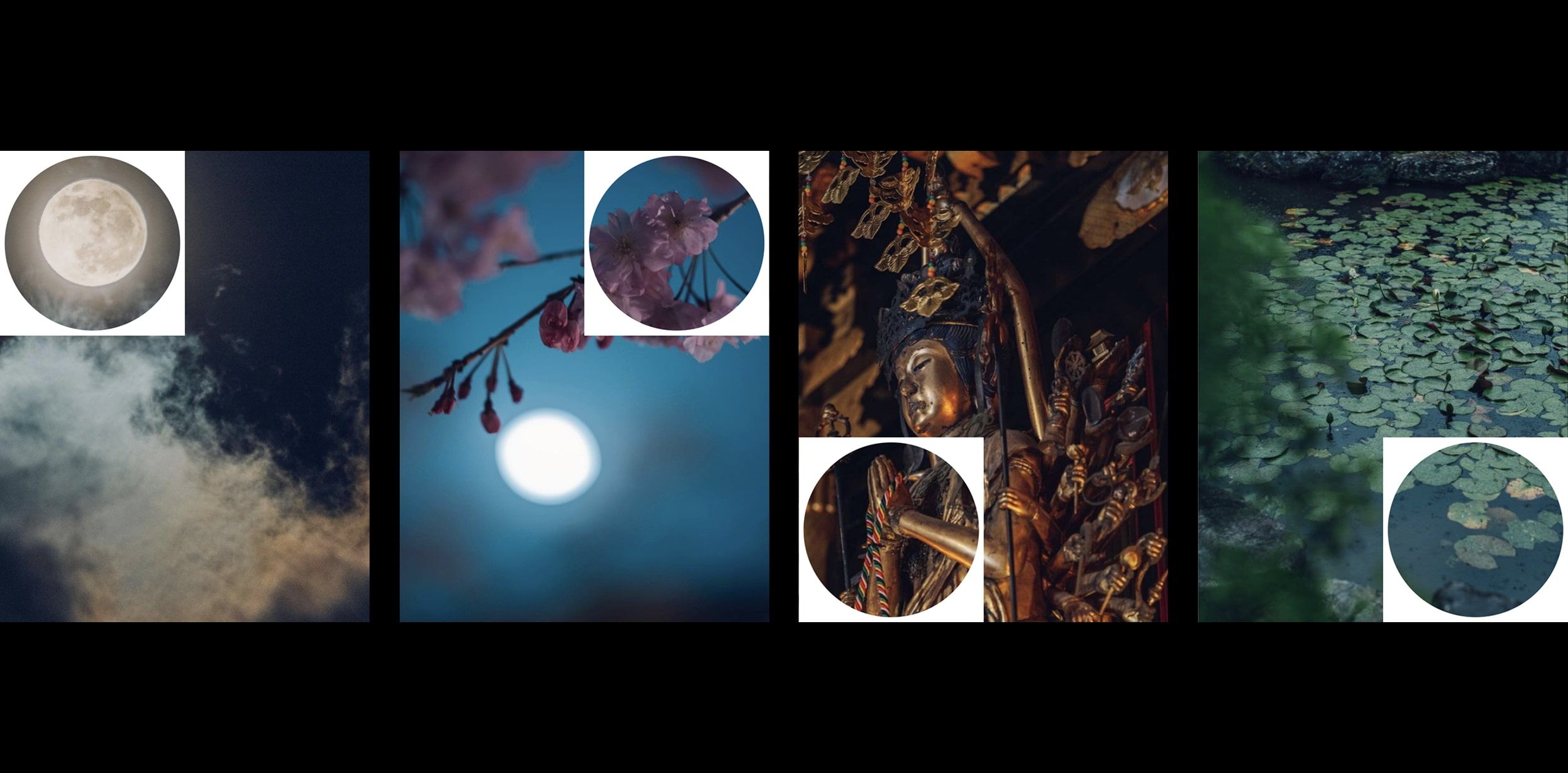
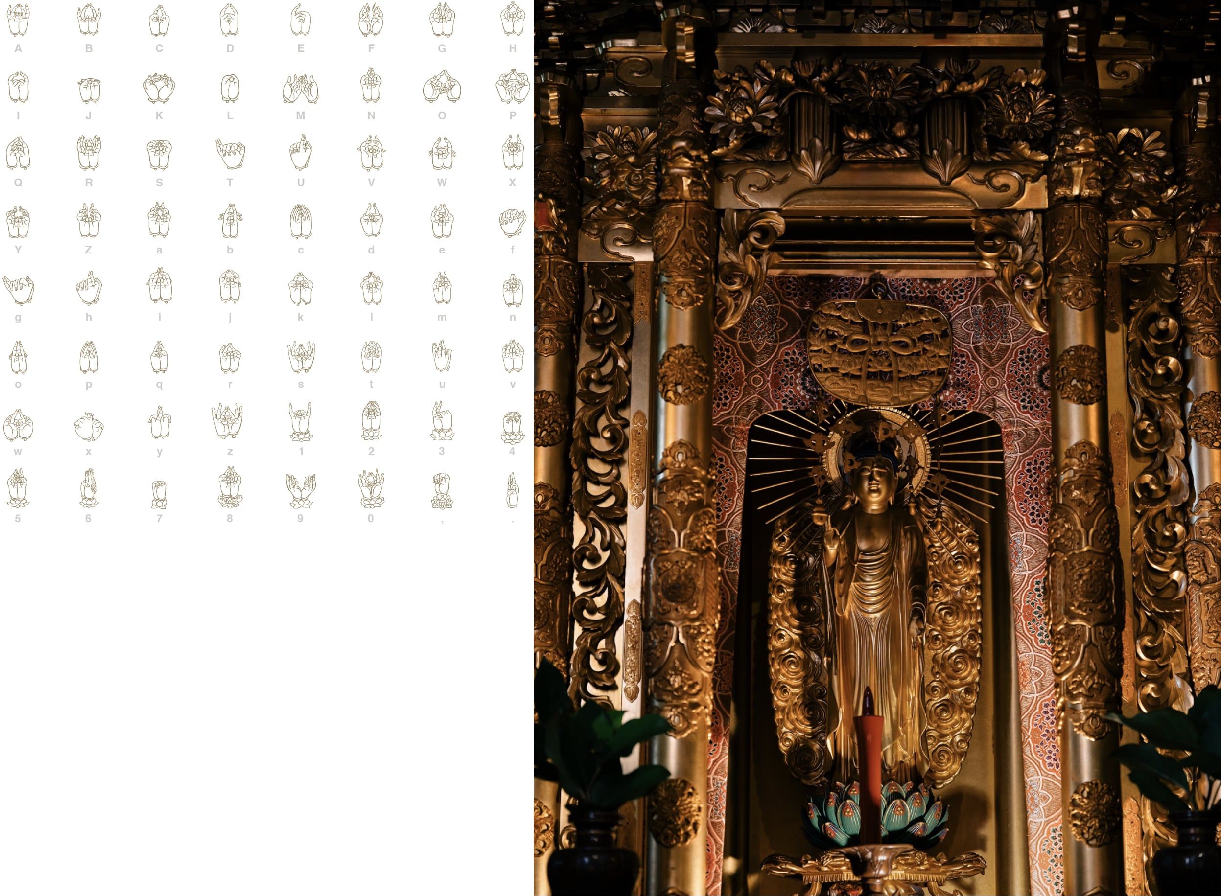
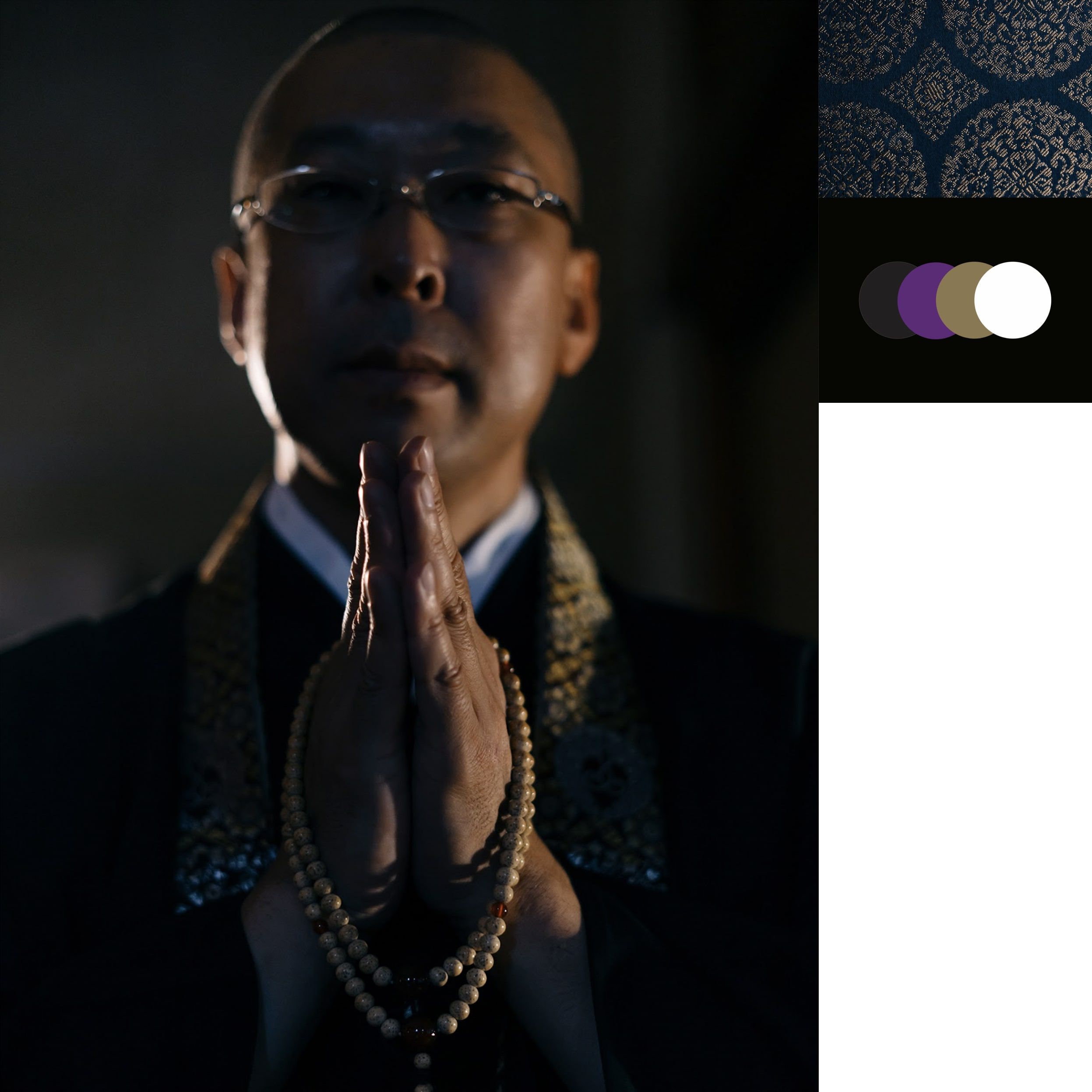
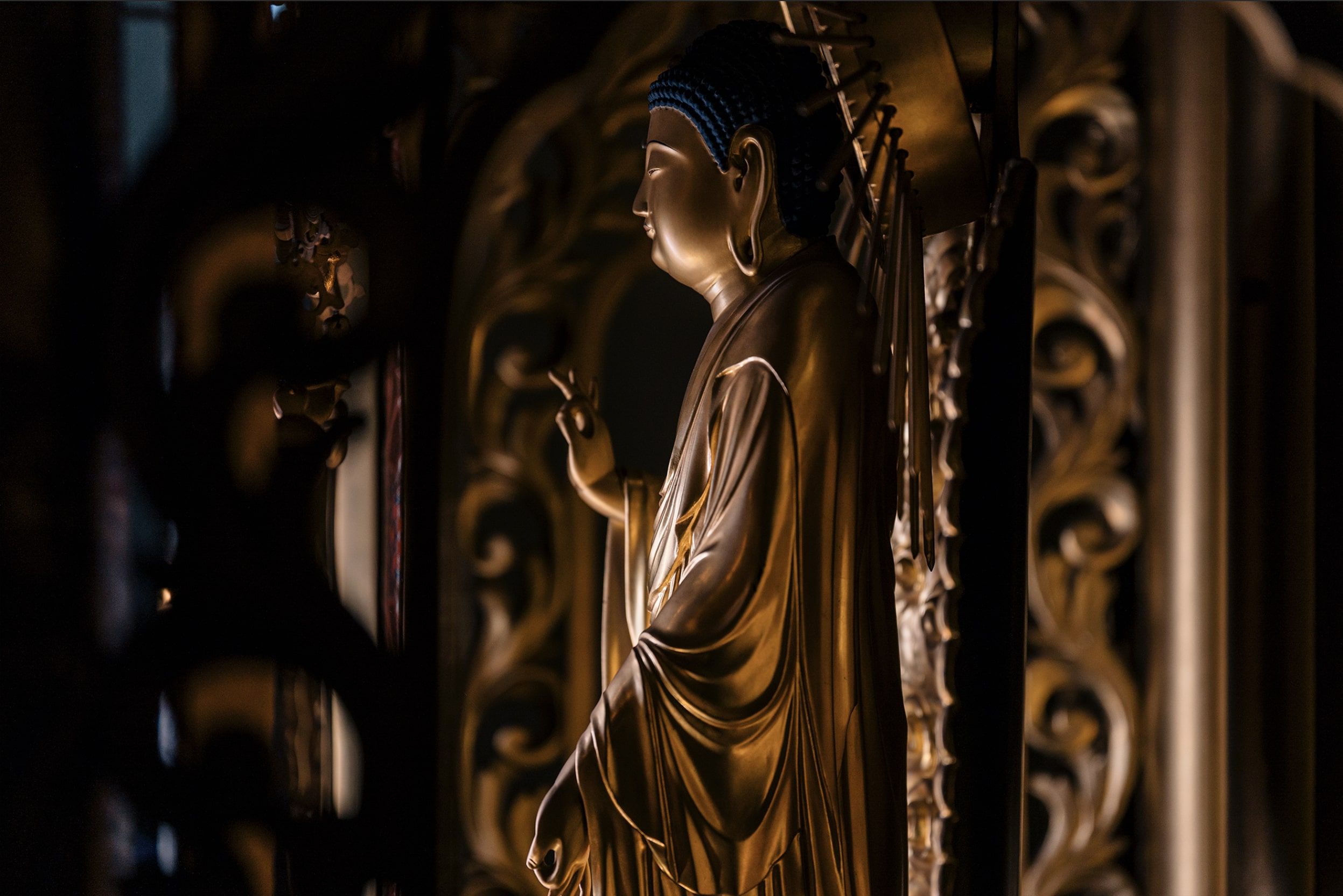
For the launch of the new website, we thought it would be a great opportunity to do a rebrand of Vancouver Buddhist Temple. This included updating the primary and secondary logo's, introducing a new type and colour system, art directed photography from the temple, and a framework for all future content that will appear on the website and in offline materials for the temple.
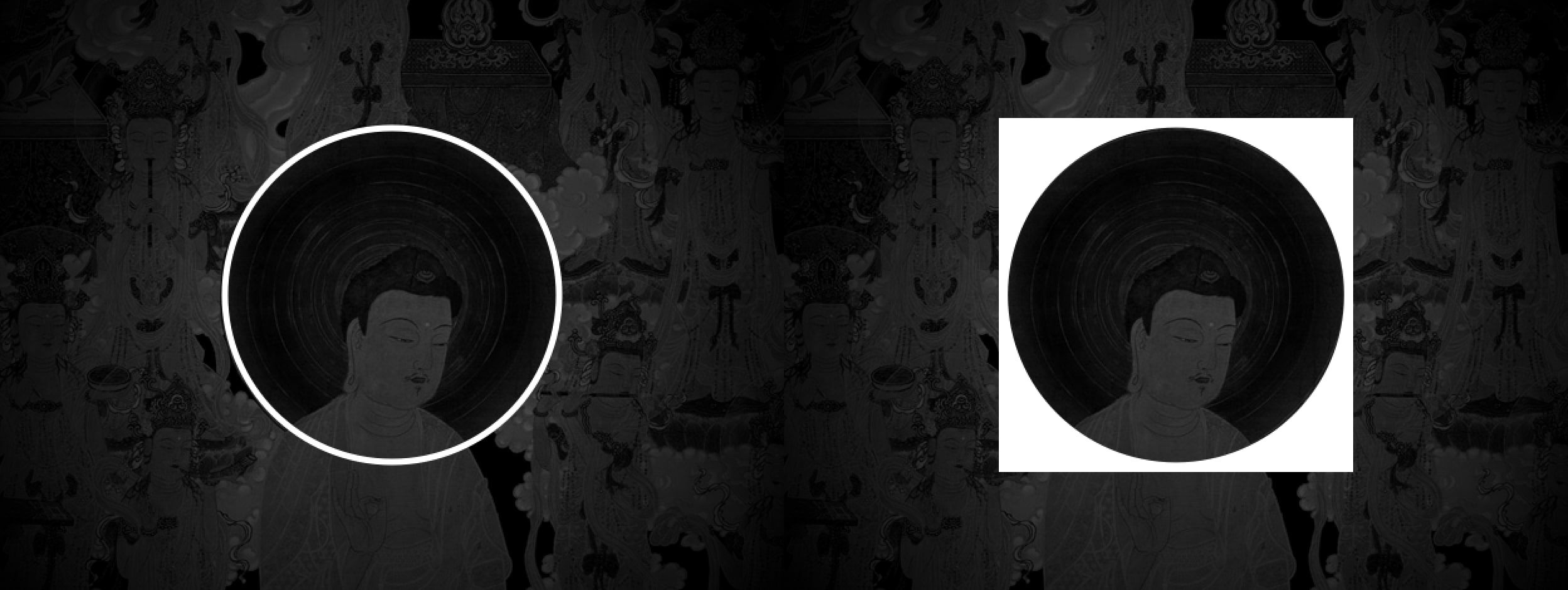
The concept for the rebrand is based on Ensō (circular form) and illustrates the following:
- Togetherness, circle of life, symbol of the start and end of all things.
- Negative space within represents both the ideas of emptiness awaiting to be filled and containing all it needs.
- Symbol of harmonious cooperation between one another, acceptance of oneself or the pursuit of personal development and self-improvement.
- Reflects the idea of how one perceives their life as full or empty. The mindset of the individual and their satisfaction with where they are at in life's journey.
- Illustrates the cyclical nature of life. Birth, death, and rebirth. Like the changing of the seasons or sunrise to sunset.
Special thanks to Bradley Low (Website developer), Mark Strathern (Designer), Norihisa Hayashi (Photographer), and Scott Strathern (Creative director and Website designer).
Please enjoy.
